KAPPA HARLEM
Differentiating a Middle School in Harlem
Project Challenge
Over the last decade, educational environment has changed and with growing popularity of charter schools, KAPPA IV has lost its competitive edge. If the school did not differentiate itself from the competition, enrollment would drop significantly in the next few years. Kappa IV needed to make a turn around in order to keep its doors open.
Project Background
KAPPA IV is a middle school in the heart of Harlem. It has been a beacon for high quality education, preparing its students for high school. As part of a KAPPA collective of schools that were united by ideology and teaching methods. KAPPA was synonymous with great education.
Insight
Through our research, we discovered that Kappa IV has a unique teaching style, where they utilize the Socratic Method throughout every aspect of their teaching curriculum and as a part of their school culture.
Solution
By breaking down the Socratic method, the team arrived at the notion of Perspective. Our strategy was to focus on the idea of questioning and exploring through different point of views. By embracing and celebrating the diverse student body and faculty, Kappa will be able to recapture its spark.
NEW BRAND STATEMENT
WE QUESTION.
BECAUSE WE ARE NEVER SATISFIED.
AND WE NEVER STOP EXPLORING THE WORLD AROUND US–
WE UNDERSTAND IT THROUGH THE DIFFERENT PERSPECTIVES WE UNCOVER.
THIS IS THE FOUNDATION OF WHAT WE BELIEVE,
THIS IS THE HEART OF KAPPA.
VISUAL IDENTITY
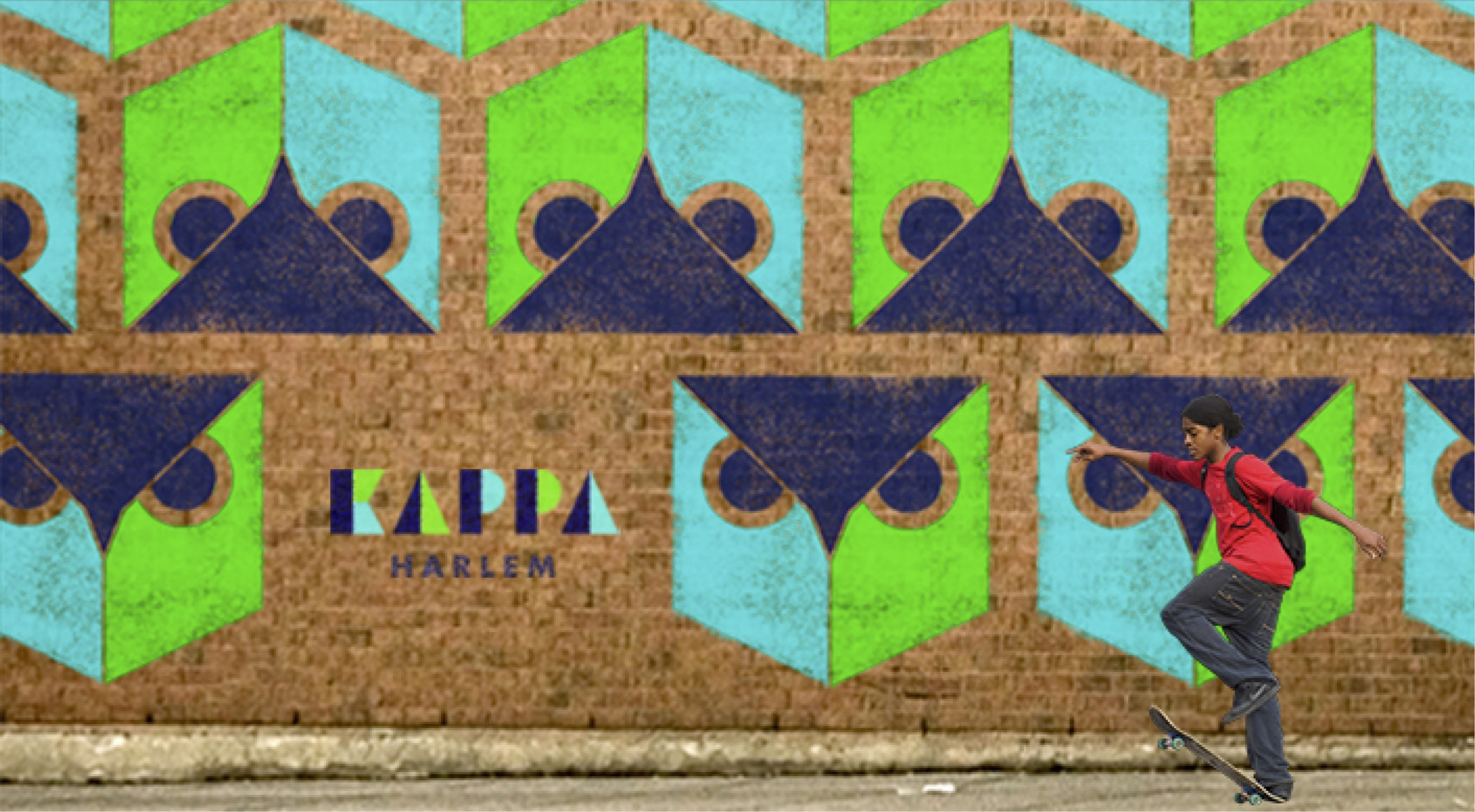
The new strategy translated into design through development of a new brand identity and development of new touch points and tools. We developed a new logo based on geometric shapes. The new collateral and educational tools were informed by the idea of perspective.
New font was developed based on geometric shapes to draw attention to key elements. It is meant to be used as an accent.
Futura font was selected to be used as the main font for all communications.
PROMOTIONAL MATERIAL
KAPPA Card
to be used as a way to get the word out about KAPPA's presence in the community. This is also can be used for various events. The card is meant to spark interest in KAPPA by tantalizing people's curiosity.
KAPPA Brochure
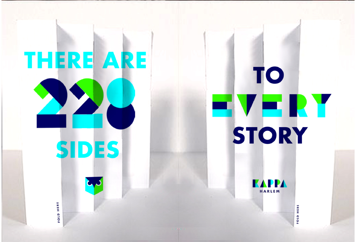
is a promotional tool to be given out at the informational secessions to the perspective students. It was designed with the idea of the perspective in mind. At first glance, the brochure looks as a bunch of gibberish, but by looking at it from the right angle, the message emerges.
TOOLS
KAPPA Website
The idea of perspective is carried out in the website design as well. The website integrates new brand identity and colors. In order to accommodate diverse student body, the website is in two languages: Spanish and English. Below the fold, KAPPA can share latest school news, as well as interesting information.
KAPPA Passport
was developed as a tool for teachers to evaluate students based on a different set of criteria of multiple perspectives.
KAPPA Cube
is a supplemental educational tool. It was based on De Bono’s six thinking hats. Each side of the cube interprets each hat. This tool can be used in the class setting to show or even to change the perspective on the subject.
ENVIRONMENT
The new KAPPA environment incorporates the new brand identity and colors against a clean background. By providing a clean space, students and faculty can interact and learn without distractions.
Team: Lana Molodtsova Ugurtas, Michi Ohira, Reese Vaccarezza, Alice Li, Allison Braund, Marissa Betley, Raz Miguel Martinez, Jennifer Passas and Maria Silva Mora
Advisors: Mark Kinglsey, Bret Sanford, Tom Guarriello


